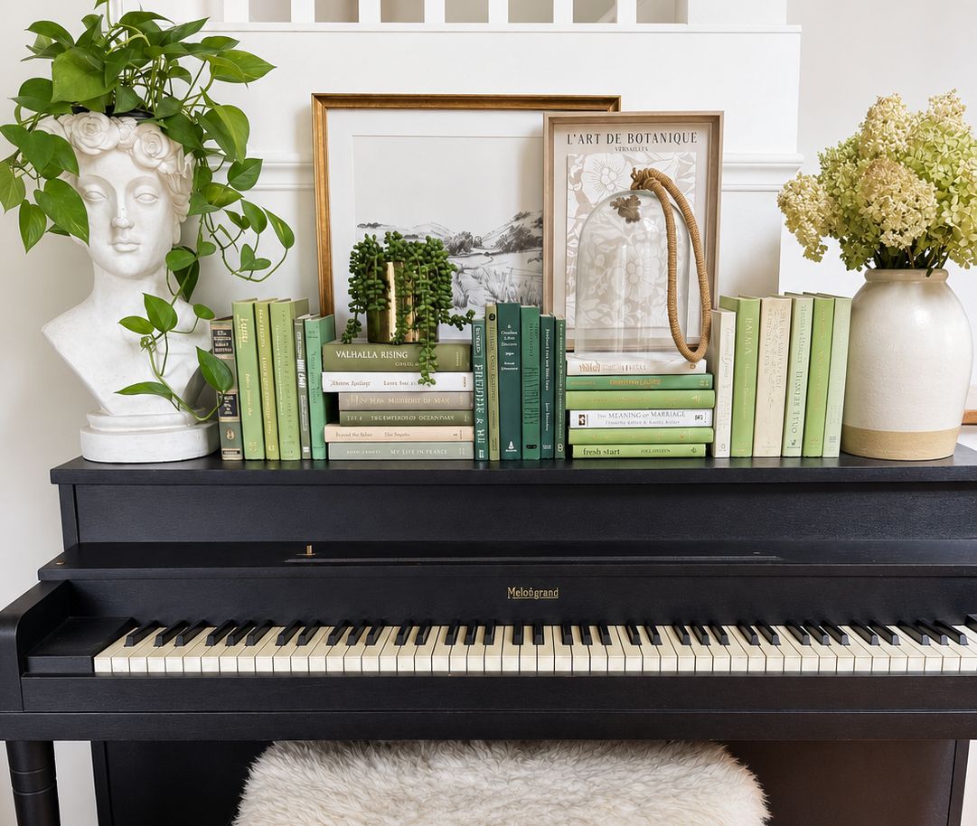
Decorative books for shelves work best when they feel assembled over time: related in palette, varied in scale, and full of the texture that only actual books bring. The aim is not a perfectly matched display. It is a collection with presence.
- Decorative books for shelves should feel collected, not manufactured.
- Build around tonal relationships rather than exact color matching.
- Vary height, thickness, cloth, paper, and typography so a grouping has rhythm.
- House of Colligere curates real hardcover books into collections shaped by color, texture, scale, and character.
A finished shelf is rarely made by choosing one beautiful spine at a time. It is made by noticing how a group of books sits together: a faded linen cover beside warm paper, a weightier volume beside a slender one, an older binding that softens an otherwise polished room. Curated by color. Collected for character.
Why decorative books belong in an interior
Books bring more than color to a shelf. Their covers, edges, materials, and proportions introduce a kind of quiet visual history. A collection can carry the weathered softness of paper, the structure of cloth, or the small irregularities of older typography.
That distinction matters because a display built from identical-looking objects can feel finished too quickly. A thoughtful grouping has a little tension in it. It relates to the room, but it does not disappear into it.
For decorative books for shelves, color is the starting point. Character is what keeps the result from feeling manufactured.
Begin with a palette, not a color match
A palette is a family of tones that belong together. It leaves room for variation. Exact matching does not.
A shelf of ivory, cream, flax, and soft brown has more depth than a shelf where every spine lands on the same beige. A sea-glass palette can hold faded blue, grey-green, washed aqua, and the occasional warm neutral. The relationship between those tones matters more than their uniformity.
Notice the undertones already in the room
Before choosing books, look at the materials around them.
- Warm woods often welcome cream, ochre, tobacco, and softened red.
- Stone, plaster, and pale upholstery leave space for cool grey, sage, blue, and weathered white.
- A darker room can hold faded color beautifully when the books retain some lightness at the edges.
- A room with strong artwork benefits from a quieter, more tonal book collection.
This is not a rule about making books disappear. It is a way to let them belong. The best palettes echo the room without repeating it word for word.
Let scale create rhythm
Scale is the conversation between heights, thicknesses, and visual weight. A row of books all cut to the same height can feel flat, even when the palette is right. A collection becomes more convincing when its forms shift gently from one book to the next.
Look for a mix of taller hardcovers, lower volumes, slimmer spines, and a few books with enough presence to anchor a stack. The variation should feel natural rather than theatrical. One substantial book can give a small grouping gravity; one narrow book can loosen it.
Compose in groups, not as individual spines
A decorative book collection is read from a distance before it is read up close. Step back and look for the overall silhouette.
- Let a few taller books make a vertical line.
- Use a horizontal stack where the shelf needs a lower, quieter shape.
- Place thicker books where a composition needs weight.
- Let slimmer volumes introduce air between heavier forms.
- Leave enough open space for the books to feel considered rather than packed in.
The goal is not symmetry. It is balance with a little movement.
Choose texture that feels lived with
Texture is often the difference between a color-led shelf and a shelf with genuine depth. Cloth covers, matte paper, embossing, visible type, softened corners, and worn edges all hold light differently. Together, they make the collection feel less like a set and more like a gathering.
Older bindings can bring a room warmth without becoming precious. A paper jacket with a slight fade can sit beautifully against a clean linen cover. Strong typography gives a spine its own voice. Even the unevenness of a book's edge has a role: it interrupts the polished sameness that makes decorative objects feel anonymous.
Prefer material variation over perfect uniformity
Uniformity has its place, but a collection needs contrast to feel collected.
- Pair cloth with paper rather than repeating one finish throughout.
- Let restrained typography sit beside a more expressive title treatment.
- Include both clean edges and books with a softened sense of age.
- Choose a few covers that deepen the palette instead of matching its lightest note.
Texture should support the room's mood. It should not become a costume.
Build composition through relationships
A book can be beautiful on its own and still feel wrong in a collection. Composition is the part of curating that asks what each book gives to the others.
A pale volume can make a darker book feel richer. A book with a narrow spine can relieve the visual weight of a broad one. A worn cover can keep an otherwise new-looking grouping from becoming too polished. The point is not to make every book equally important. It is to make each one useful to the whole.
Give the collection a center of gravity
Every finished grouping benefits from a point of calm. It might be the deepest color in the palette, the largest book in the stack, or an especially tactile cover. Once that anchor is in place, the surrounding books can soften, brighten, or complicate it.
This is where one-of-a-kind collections become valuable. Sourcing individual hardcovers gives a curator access to relationships that cannot be produced by repeating the same object. The books are chosen for how they work together, not merely for how they look in isolation.
Keep character in the finished effect
Character is not the opposite of restraint. It is the small evidence that the collection has been chosen rather than manufactured.
A collection with character does not need to announce itself. It has variation in thickness and finish. Its palette has depth. Its books carry different kinds of visual memory: a quiet cloth cover, an expressive title, a paper edge that has softened with time. The result feels at home beside art, ceramics, wood, linen, and the other objects that make a room personal.
What to avoid is the impression of an interchangeable decorative set. When every spine shares the same finish, scale, and degree of polish, the eye reads the repetition before it reads the collection. A little irregularity is what makes the arrangement believable.
When a curated collection is the right starting point
Sourcing books individually is an intimate process. It also asks for patience, a developed eye, and time spent comparing pieces that will live together. For someone who wants the finished effect without searching for every book themselves, House of Colligere offers a more considered path.
House of Colligere sources real hardcover books individually and curates them into one-of-a-kind collections built around color, texture, scale, and character. The color-led approach gives the collection a clear place in the room; the actual books give it the depth that mass-produced décor cannot replicate.
The result is not a generic pile of books. It is a group of objects selected to sit together with ease: layered, tactile, and quietly distinct.
A simple way to judge a collection
Before bringing decorative books into a room, ask five questions.
Does the palette relate to the room?
Look for tonal kinship rather than perfect coordination. The books should belong with the materials already there while still bringing their own depth.
Is there enough variation in scale?
A collection needs a mix of height and thickness to create rhythm. Repetition can be calming; too much repetition can make a shelf feel static.
Do the materials have texture?
Cloth, paper, typography, softened edges, and different finishes give the collection a lived-in quality. Texture makes color feel more dimensional.
Does the composition work as a whole?
Look at the grouping from across the room. The books should form a balanced shape before any individual title asks for attention.
Does it feel collected rather than manufactured?
This is the final test. The best decorative books for shelves look like they have been chosen with care, not assembled from a single mold.
FAQ
How do I choose decorative books for shelves?
Choose decorative books for shelves by looking first at palette, scale, texture, composition, and character. A strong collection uses real variation so it feels collected rather than manufactured.
Should decorative books match my room exactly?
Decorative books should relate to the room without matching every surface exactly. Tonal relationships create a layered effect that feels more natural than one identical shade repeated throughout.
What makes a book collection look collected?
A book collection looks collected when its books vary in height, thickness, finish, typography, and sense of age while sharing a considered palette. The relationship between the books matters more than perfect uniformity.
Are real books better than mass-produced decorative book sets?
Real books bring the texture, proportions, and visual history that give a shelf character. A curated group of actual hardcovers feels more individual because each book contributes something different to the composition.
How does House of Colligere curate decorative book collections?
House of Colligere sources real hardcover books individually and curates one-of-a-kind collections around color, texture, scale, and character. The aim is a finished effect that feels collected, not manufactured.
Can decorative books work in a neutral room?
Decorative books work especially well in neutral rooms when the palette includes related creams, ivories, warm browns, or softened greys. Variation in material and scale keeps a quiet palette from feeling flat.
One last thing
The most enduring shelves are not built around an exact color match. They are built around a point of view. Choose books with tonal connection, material presence, and enough variation to feel as though they have always belonged together. House of Colligere begins with color and finishes with character.